


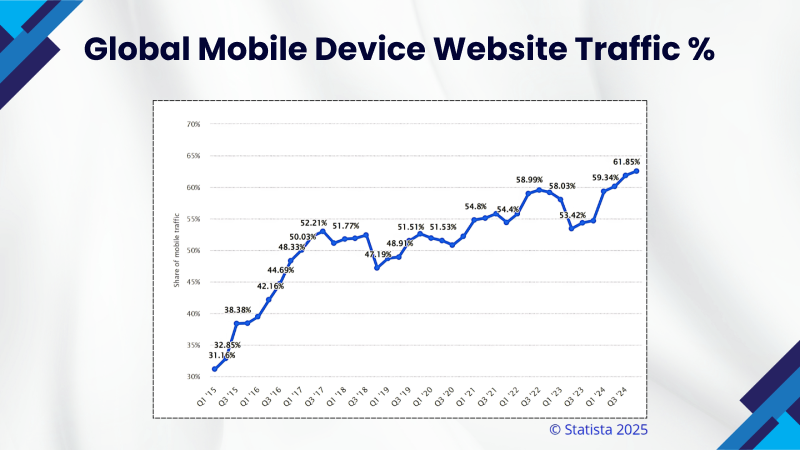
Have you heard of it? 57% of users are skeptical about recommending a business with a terribly designed website. That’s not all— mobile devices accounted for 58.67% of global website traffic in the last quarter of 2023; However – these facts are not just highlighting the trends, but also a necessity.


These days, responsive web design is a must-have feature as we no longer live in a world where we design for a limited number of screens. With an increasing variety of devices, building websites that are easily resized on all screen dimensions has everything to do with delivering a polished user experience – no matter where or how it’s accessed.
Whether launching a business website or a passion project, creating a responsive website should be easy and exciting. At Expedey, we can help you build mobile-ready sites in minutes—with no code at all. So, why wait any longer? Let’s get started on building a responsive website you’ve always dreamed of!
What is Responsive Design?
15 years since surfing the web meant sitting at a desk with a chunky monitor. But today? The world in your pocket, with smartphones, tablets, and laptops offering countless ways to go online – has made responsive design the keystone of a pleasant user experience.
In essence, responsive design ensures your website looks and works flawlessly across all devices, no matter the screen size. For instance, on a smartphone, the content might stack neatly in one column, while on a laptop, it spreads across two – however, the layout may adjust, but your branding and content stay consistent—just as they should.
Google Search Central highlights the importance of this, stating:
"Mobile is changing the world. Nowadays, everyone has smartphones, constantly communicating and looking for information. In many countries, the smartphone number has beaten the personal computers’ number; having a mobile-friendly website has become increasingly imperative for having an online presence."
It not only optimizes scrolling, zooming, and panning but also increases user satisfaction – ensuring that your site appears attractive on a 4-inch phone screen as it does on a 17-inch laptop to keep your audience interested in what you have to offer – irrespective of where they are.

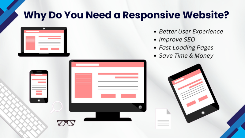
Why Do You Need a Responsive Website?
In the contemporary sphere, where users surf the internet using all kinds of gadgets, including smartphones, tablets, and desktops—a responsive website ensures:
A Better Experience for Everyone: Whether the user is on a small mobile screen or a large desktop monitor, a responsive design makes your website fascinating to the eye and smooth to use.
Reach More People on Mobile: More than 50% of all web traffic now comes from mobile devices so if your site works perfectly on smartphones and tablets, you’ll keep more users engaged.
Improve Your SEO: Google loves mobile-friendly websites; thus, users can attract more non-paid traffic and outrank in SERPs with a responsive web design.
Speed Matters: Fast-loading pages keep visitors happy and cut down bounce rates. Responsiveness often goes hand-in-hand with better performance.
Save Time and Money: Managing one responsive site is far more efficient than maintaining separate desktop and mobile versions as it’s easier to update and costs less sooner or later.
Ready for the Future: As new devices come out, a responsive website will adjust automatically to keep your content accessible for years to come.
How to Build a Responsive Website?
Knowing the importance of a responsive website, here are some simple steps to help your site adapt better to different devices:
Use a Fluid Grid
In former times, websites were built using fixed pixel measurements, but that approach doesn’t work well on today’s variety of screen sizes – that’s why designers now use fluid grids.
What’s a fluid grid?
It’s a layout system where your site’s elements are sized proportionally instead of being locked into specific pixel dimensions. This makes your content flexible, so it automatically adjusts to fit any screen size.
How does it help?
A responsive grid typically divides your site into columns, and the heights and widths of elements scale based on the screen size. Nothing has a fixed size—instead, everything resizes in proportion to the available space.
How do you make it work?
By updating your website’s CSS, you can set rules for the grid, use percentages for widths and heights instead of pixels, and also use media queries to tweak the layout for different devices.


Make Your Site Touchscreen-Friendly
Since most laptops now have touchscreens, ensure to design your site in a way that works well for both mouse users and touchscreen users.
Consider touch-friendly elements: If you have a form with a drop-down menu on your website’s desktop version, style it to be larger and more touch-friendly so that users can easily interact with the touchscreens.
Larger buttons are better: Small buttons or links can be hard to click on with a finger, especially on mobile phones. To be easily tapped on any device, ensure buttons, images, and calls to action are big enough.
By keeping these tips in mind, you’ll ensure that your site is usable for one and all, regardless of how they’re surfing.
Choose What to Include on Smaller Screens
Responsive design does not mean duplicating the exact same website from one device to another. If you are looking for the best user experience that means you need to leave out some content or simplify things in a way so the site remains easy to navigate.
For instance, instead of displaying an entire menu of buttons on a smaller screen, you would reduce a larger menu for your site, hiding it behind a single button with which a user taps to extend.
You can customize what to display or hide by adjusting your site’s CSS and code – it might take some time to set this up, but your users will definitely appreciate the more user-friendly experience!

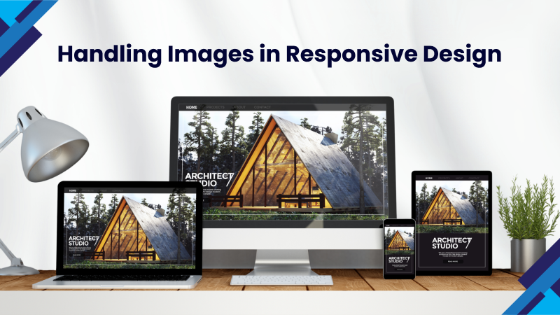
Handling Images in Responsive Design
Handling images in responsive design can be complex, but it’s important to get it right – all you need to set specific rules in your CSS to ensure they look great on all screen sizes.
Start by using relative units like percentages for widths instead of fixed pixel sizes. For instance, setting an image to max-width: 100% ensures it scales within its container without overflowing. You can also use media queries to define different behaviors for various screen sizes, like resizing or hiding images on smaller devices to improve load times and usability.
For complex designs, consider modern tools like CSS object-fit or responsive image tags (<picture> and <source>) for better control.
Define Typography for Responsiveness
In traditional web design, font sizes are often set in pixels, which works fine for static layouts. However, for responsive websites, font sizes need to be adjusted based on the screen size. A responsive font ensures that text remains readable across all devices.
To achieve this, use the “rem (root element's font-size) unit” in your CSS. Unlike the “em unit”, which is relative to its parent element, “rem” is based on the root HTML element that makes it easier to maintain consistent typography throughout your site while allowing it to scale naturally with different screen sizes.
Embrace Negative Space
Negative space, or white space – is the vacant space around elements on your website. It gives your design breathing room so that the layout does not feel cluttered as too many graphics or oversized text can be irresistible for users to focus on and might drive them away from your site.
When designing responsively, negative space plays a key role. It’s about finding balance—keeping your layout clean and minimal while ensuring important content stands out. To enhance both the visuals and user experience, use negative space to create breaks in your design, increase readability, and highlight those areas of content you don’t want anyone to miss.

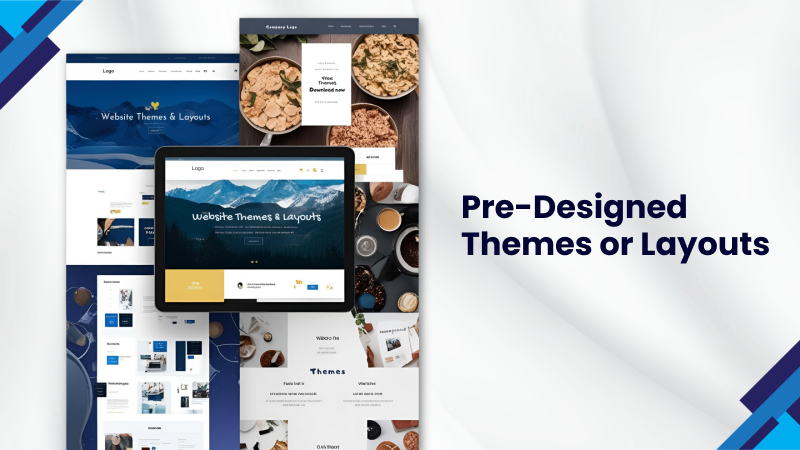
Consider Using a Pre-Designed Theme or Layout
If you’re not a designer, you’ll then need an extra hand to make your site responsive. You can utilize a pre-designed theme or layout that already has responsive features built – this way, you don’t have to start from scratch, but all you need is to update the colors, branding, and content adapted to your business’s needs.
Though, many free and paid themes in WordPress and ecommerce platforms are responsive right out of the box, so you can easily get started without any difficulties.
Test Responsiveness on Real Devices
When working on making a website mobile-responsive, one crucial step that's often overlooked is testing on real devices. While developers can make numerous code adjustments, it's essential to verify the functionality under real user conditions to ensure optimal performance.
For that, test your site on all types of gadgets, including smartphones, tablets, and desktops, to ensure it is both aesthetic and functional when used by various devices.
Once you have designed your site, run it through a responsive design checker by entering your website URL, and the tool will show you how it looks on diverse screen sizes – it’s a really quick and easy way to catch any issues!


Outsource Your Project
If you don’t use WordPress or a hosted ecommerce website, you might struggle to locate a pre-designed template or something more unique that serves your needs; in that case, you can always hire a professional to create something custom for you!
At Expedey, we specialize in creating responsive websites from scratch on whatever platform you prefer, so that you don’t need to be stressed about making your site mobile-friendly later.
Another option is to hire a freelancer to redesign your site, but be sure to check their references, as this is a specialized task. Creating responsive websites needs solid experience in web design, and it’s not an area where you should compromise on price – allocate enough of your budget to hire someone so you don’t have to deal with this issue again in just a few months.
Summing Up
Responsive design includes building websites or applications that adjust to the screen dimensions they’re being viewed on. It combines CSS and HTML techniques and has become the standard way we build websites today. Think about the sites you visit on your phone—it's rare to find one that looks like a scaled-down desktop version or forces you to scroll sideways to see everything. That’s due to responsive design!
The good news is that making responsive designs is much easier now than it used to be. With modern CSS and HTML, you have powerful tools at your disposal to create clean, functional designs for any device. If you want to make your business website responsive – connect with Expedey for a site design that boosts credibility and drives client acquisition. Remember, website first impressions matter—make them count!
Recent Blogs


What is Meant by Trustless Transactions in Blockchain?
Discover how trustless transactions in blockchain eliminate the need for intermediaries, ensuring transparency, security, and automation through smart contracts. Explore the future of decentralized, trust-free transactions


Benefits Of Using WordPress For Your Ecommerce Website
Discover the benefits of using WordPress for your ecommerce website. Learn how WordPress and WooCommerce offer flexibility, customization, and scalability to grow your online store effortlessly.


How To Optimize Website Performance
Struggling with a slow website? Discover top web performance optimization strategies to improve speed, enhance UX, and rank higher on search engines.

Quick Links
Our Offices

USA
12828 Willow Centre Dr Ste D #978 Houston, TX 77066
PAKISTAN
Suite # 207, 2nd Floor, Park Avenue Building, Block 6, P.E.C.H.S, Shahrah-e-Faisal, Karachi.Contact Us


© 2024 Expedey. All Rights Reserved.